어드민 페이지를 구현하고 있다. 디자인 적인 요소는 거의 없고, 내용 위주라서 UI 구현 단계에서 큰 어려움이 없이 진행 중이다.
그리고, 이번 어드민 페이지에서 가장 많이 사용되는 컴포넌트는 모달(컨펌창)이다.
그동안 모달을 구현하면서, 라이브러리 없이 구현한 적이 거의 없었던 것 같아서 이번 기회에 라이브러리 없이 모달(컨펌창)을 구현하고자 한다.
사실 css 프레임워크를 antd를 쓸까 bootstarap을 쓸까 MUI를 쓸까... 고민을 했는데, 어차피 디자인이 따로 있는 경우에서 라이브러리를 써봤자, 거의 다 다시 구현하는 기분이 들어서, 그냥 내가 구현해보기로 했다 !
구현하고자 하는 것

- 어드민 페이지의 디자인은 간단하다!
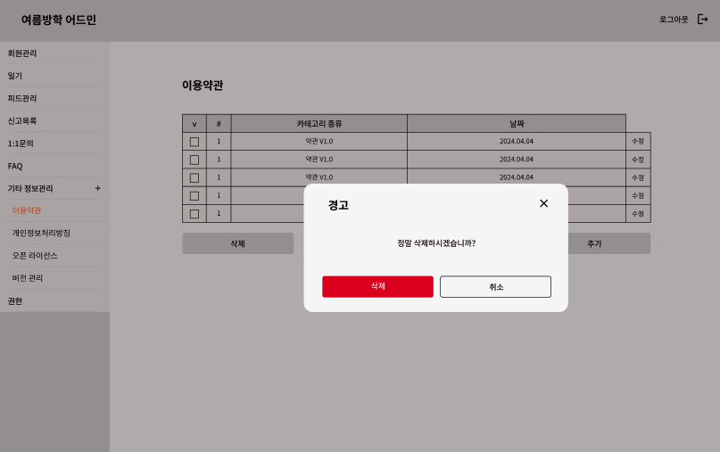
- 회원 삭제 같은 데이터 삭제 버튼을 눌렀을 때, 왼쪽 사진처럼 경고 창이 뜨게 할 것이다.
- 데이터 삭제처럼 중요하고 위험한 것들은 ok버튼이 빨간색인 모달창을, 경고 보내기 처럼 데이터가 날라가지는 않는 것에 대한 ok 버튼은 서비스의 메인 색인 주황색으로 하려고 한다.
- 모달이 떴을때, 뒤에 있는 배경은 흐리게 변해야 한다.
- 중간 텍스트, ok버튼의 텍스트는 상황에 따라 바뀌어야 한다.
UI 구성
tailwind를 사용한 이후로 정말 너무 일이 편해졌다. 이전에 했던 프로젝트를 수정할 일이 있어서 tailwind 안쓴 코드를 수정해봤는데, 고새 좀 불편해졌더라 ..
props 정의
일단, UI 구성을 위해서는 title, content, okButtonText, okButtonType을 넘겨받는다.
interface ConfirmModalProps {
  title?: string;
  content: ReactNode;
  okButtonText?: string;
  okButtonType?: "warning" | "default";
}
어드민 페이지에서 삭제에 대한 모달이 가장 많아서, 아래처럼 디폴트 값을 정해주었다.
const ConfirmModal = ({
  title = "경고",
  content,
  okButtonText = "삭제",
  okButtonType = "warning",
}: ConfirmModalProps)
JSX 코드 작성
디자인에 맞게 JSX 코드를 작성한다.
okButtonType이 warning일 때는 버튼의 배경색이 빨간색이 되도록, 아닐때는 주황색이 되도록 한다. (색상 코드는 tawilwind 설정에 커스텀해놓음)
  <div className="top-1/2 left-1/2 -translate-x-1/2 -translate-y-1/2 absolute w-96 h-48 rounded-lg z-50 px-5 py-4 flex flex-col items-center bg-white shadow-sm drop-shadow-lg justify-between">
    <div className="flex justify-between w-full">
      <span className="font-bold text-lg">{title}</span>
      <button>
        <CloseIcon />
      </button>
    </div>
    <div>{content}</div>
    <div className="flex gap-2">
      <button
        className={`text-white rounded-md py-1 w-40 ${
          okButtonType === "warning" ? "bg-error-red" : "bg-primary-orange"
        }`}
      >
        {okButtonText}
      </button>
      <button
        className={`text-black rounded-md py-1 w-40  border border-black border-solid`}
      >
        취소
      </button>
    </div>
  </div>
사용하기
  <ConfirmModal
    content="정말 삭제하시겠습니까?"
  />
toggle
- 삭제 버튼을 눌렀을 때, 해당 모달 창이 보여져야 한다.
- 취소 버튼 / 닫기 버튼을 눌렀을 때, 해당 모달 창이 사라져야 한다.
- 삭제(ok) 버튼 클릭 시 해당하는 동작이 수행되어야 한다.
isOpen state
먼저, 이 모달을 사용하는 컴포넌트에서 open 값을 저장하는 state를 선언한다.
const [isOpenDeleteModal, setIsOpenDeleteModal] = useState(false);토글 기능을 하는 함수를 정의한다.
  const toggleIsOpenDeleteModal = () => {
    setIsOpenDeleteModal(!isOpenDeleteModal);
  };
삭제 버튼의 onClick 함수에 toggle 함수를 넘겨주어, 삭제 버튼을 눌렀을 때, 모달 창이 열리도록 한다.
  <button
    className="bg-error-red rounded-md py-1 text-white "
    onClick={toggleIsOpenDeleteModal}
  >
    삭제
  </button>
props 추가하기
기존 props에서 toggleOpen 함수, onOk 함수, open 값을 추가로 넘겨받는다.
interface ConfirmModalProps {
  title?: string;
  content: ReactNode;
  toggleOpen: () => void;
  onOk?: () => void;
  okButtonText?: string;
  okButtonType?: "warning" | "default";
  open: boolean;
}
open & toggle & onClose 추가하기
해당 모달 컴포넌트를 open이 true일때만 보이도록 아래처럼 open &&을 추가한다.
open && (
  <div className="top-1/2 left-1/2 -translate-x-1/2 -translate-y-1/2 absolute w-96 h-48 rounded-lg z-50 px-5 py-4 flex flex-col items-center bg-white shadow-sm drop-shadow-lg justify-between">
	/* */
  </div>
)
close 버튼과 취소 버튼에 toggle 함수를 onClick으로 넘겨준다.
      <button onClick={toggleOpen}>
        <CloseIcon />
      </button>

    <button
        className={`text-black rounded-md py-1 w-40  border border-black border-solid`}
        onClick={toggleOpen}
      >
        취소
      </button>
open과 toggleOpen을 추가로 넘겨준다.
  <ConfirmModal
    content="정말 삭제하시겠습니까?"
    open={isOpenDeleteModal}
    toggleOpen={toggleIsOpenDeleteModal}
  />
뒷배경 흐리게 하기
간단하다. 모달 창을 div로 감싸준다. 그리고 해당 배경 색을 검정색으로, 투명도를 30%로 설정한다.
  <div className="top-0 left-0 w-dvw h-dvh bg-black bg-opacity-30 z-10 absolute">
    /* 기존 모달 컴포넌트 내용 동일 */
  </div>
모달이 뜨면서 뒷배경이 흐려진다. 배경의 투명도를 조절하여 배경의 흐림 정도를 조절할 수 있다.
모달 바깥 영역 클릭 시 모달 닫기
useRef를 사용한다.
모달의 ref modalRef를 정의한다.
const modalRef = useRef(null);모달의 div의 ref에 modalRef를 넘겨준다.
    <div
      ref={modalRef}>
      /* */
useEffect 훅 내에서 모달 컴포넌트의 바깥 영역이 클릭되면 호출될 함수 onClickOutside를 정의한다.
onClickOutSide 함수는
- open(모달이 open)이면서,
- modalRef를 가리키는 돔 요소가 있고,
- 그 modalRef가 가리키는 요소에 MouseEvent 의 target이 포함되지 않았을 때
- toggleOpen을 호출하여 모달을 닫는다.
document.addEventListener("mousedown", handleClickOutside); 마우스 클릭 이벤트가 감지되면 onClickOutside 함수를 호출한다.
컴포넌트가 언마운트 될때, 마우스 클릭 이벤트리스너를 제거한다.
  useEffect(() => {
    const onClickOutside = (e: MouseEvent) => {
      if (
        open &&
        modalRef.current &&
        !modalRef.current.contains(e.target as Node)
      ) {
        toggleOpen();
      }
    };

    document.addEventListener("mousedown", onClickOutside);
    return () => {
      document.removeEventListener("mousedown", onClickOutside);
    };
  }, [open, toggleOpen]);
전체코드
import { ReactNode, useEffect, useRef } from "react";
import CloseIcon from "../../assets/icons/CloseIcon";
interface ConfirmModalProps {
title?: string;
content: ReactNode;
toggleOpen: () => void;
onOk?: () => void;
okButtonText?: string;
okButtonType?: "warning" | "default";
open: boolean;
}
const ConfirmModal = ({
title = "경고",
content,
toggleOpen,
onOk,
okButtonText = "삭제",
okButtonType = "warning",
open,
}: ConfirmModalProps) => {
const modalRef = useRef<HTMLDivElement>(null);
useEffect(() => {
const onClickOutside = (e: MouseEvent) => {
if (
open &&
modalRef.current &&
!modalRef.current.contains(e.target as Node)
) {
toggleOpen();
}
};
document.addEventListener("mousedown", onClickOutside);
return () => {
document.removeEventListener("mousedown", onClickOutside);
};
}, [open, toggleOpen]);
return (
open && (
<div className="top-0 left-0 w-dvw h-dvh bg-black bg-opacity-30 z-10 absolute">
<div
ref={modalRef}
className="top-1/2 left-1/2 -translate-x-1/2 -translate-y-1/2 absolute w-96 h-48 rounded-lg z-50 px-5 py-4 flex flex-col items-center bg-white shadow-sm drop-shadow-lg justify-between"
>
<div className="flex justify-between w-full">
<span className="font-bold text-lg">{title}</span>
<button onClick={toggleOpen}>
<CloseIcon />
</button>
</div>
<div>{content}</div>
<div className="flex gap-2">
<button
className={`text-white rounded-md py-1 w-40 ${
okButtonType === "warning"
? "bg-error-red"
: "bg-primary-orange"
}`}
onClick={onOk}
>
{okButtonText}
</button>
<button
className={`text-black rounded-md py-1 w-40 border border-black border-solid`}
onClick={toggleOpen}
>
취소
</button>
</div>
</div>
</div>
)
);
};
export default ConfirmModal;
'FRONTEND > React' 카테고리의 다른 글
| [ React + Recoil ] ToastMessage 커스텀 훅 제작 (토스트메시지, useToastMessage) (0) | 2024.04.16 |
|---|---|
| [ React ] 15초 후 다음 페이지로 자동 이동 기능 (0) | 2024.03.24 |
| [ React + vercel ] vercel로 배포한 React 앱에 vercel analytics 사용하기 (0) | 2024.03.19 |
| [ React ] 더 나은 사용자 경험을 위한 스켈레톤 UI (1) | 2024.03.14 |
| [ React ] textarea / input 태그 maxLength 속성 한글에서만 작동하지 않음 해결 (0) | 2024.03.08 |